We are convinced that many of you will identify with the story of this family: a young couple with a two-year-old child living in a 53 square meter apartment. From the moment the family grew, they knew that at some point they would have to rearrange the space.
They wanted another room so that their child could have his own space, and they, in turn, the intimacy of a matrimonial bedroom. The desire existed, but they didn't know how they would fulfill this plan. They turned to designer Nika Rusanova for help. Here's how their apartment space was transformed.
First of all, you should know that such a modification cannot be made haphazardly. Any repartitioning requires technical expertise to determine if it can be carried out.
It is important to remember this and not start breaking down any walls in your house just because you saw it on the internet! In our case, the designer's proposals could be implemented after verifying the load-bearing structures of the apartment.
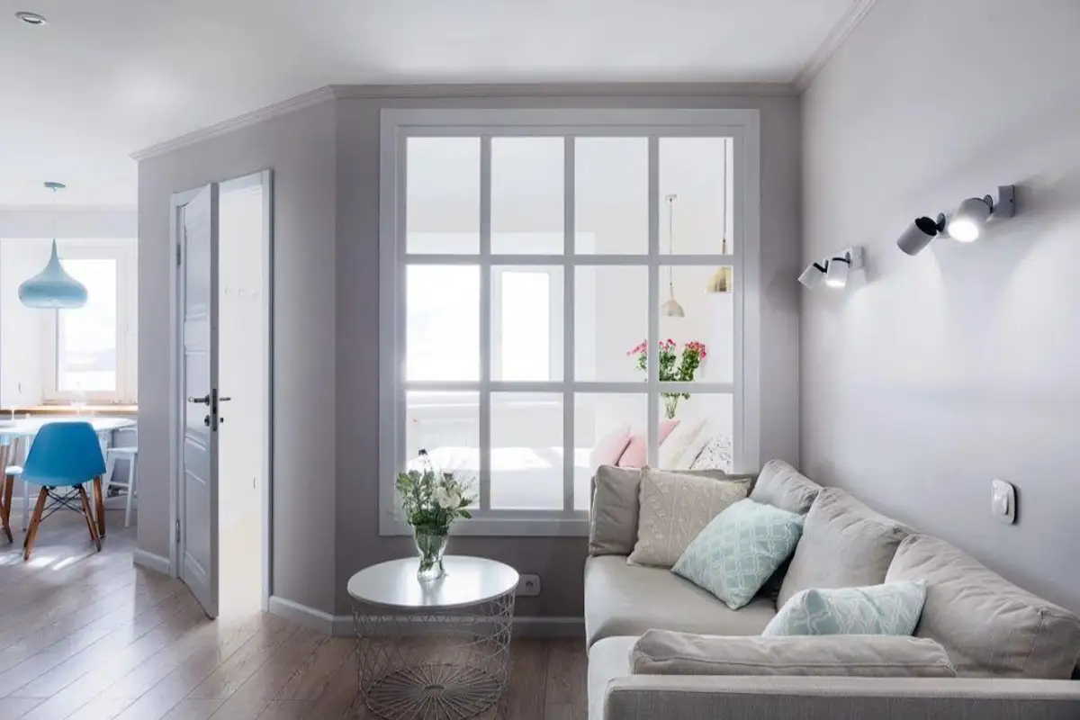
In any type of renovation of this kind, there will always be compromises. This time, the space sacrificed was the living room which reduced its dimensions to integrate the parents' bedroom (use the apartment plans from the gallery above to follow how the space was reconfigured and the functions redistributed).
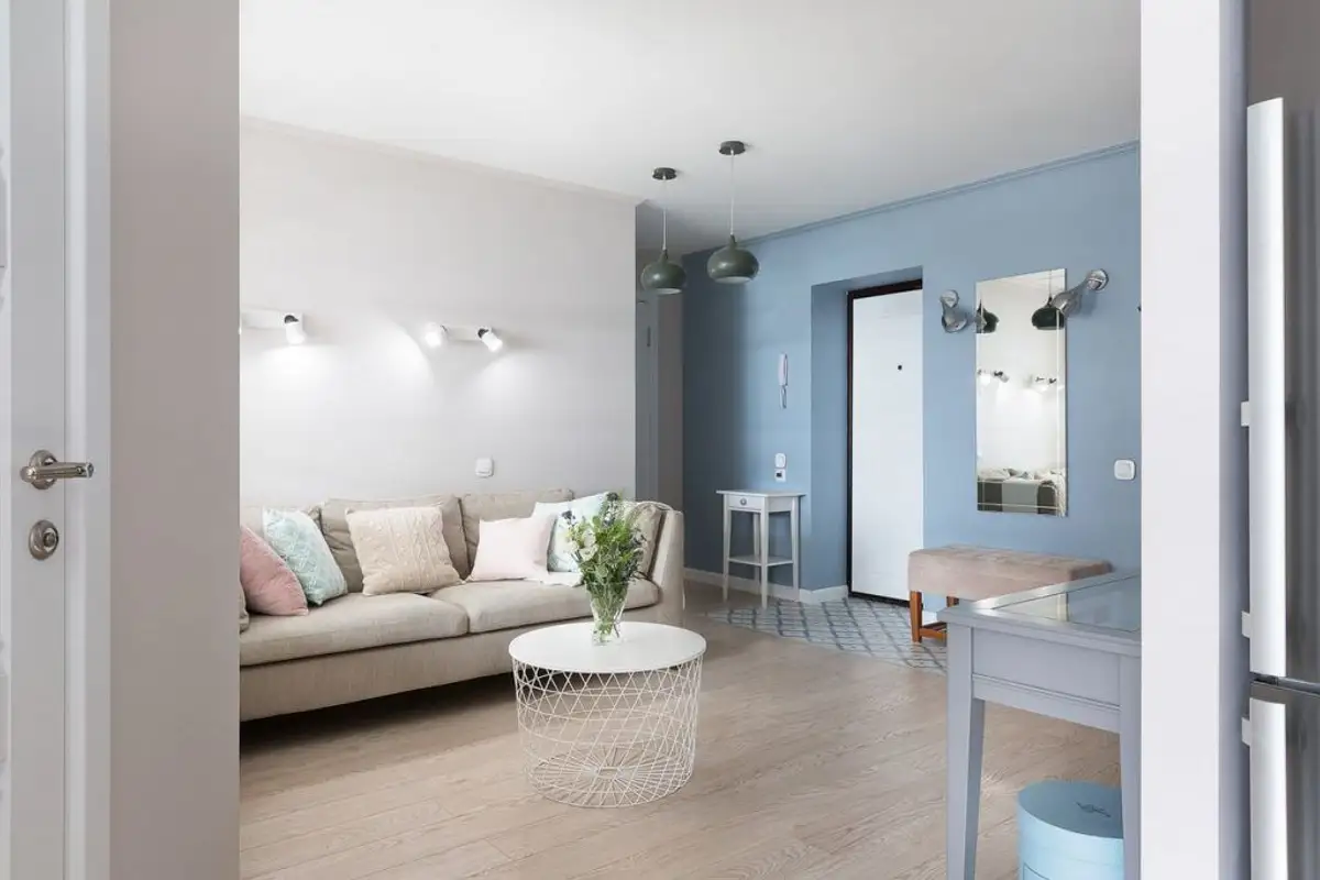
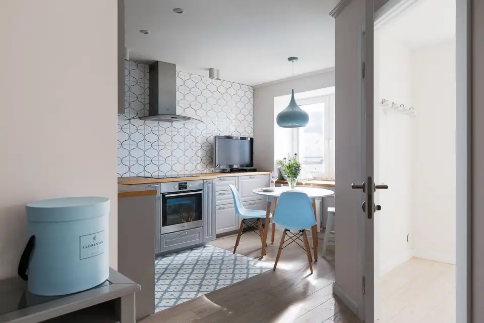
Thus, the kitchen was opened to the living room, the bathroom was slightly enlarged to easily integrate a bathtub, and the pantry next to the child's room was also enlarged to become a real dressing room, practically the main storage area of the house. The hallway was also eliminated, and the entrance to the apartment is now directly into the open living space.
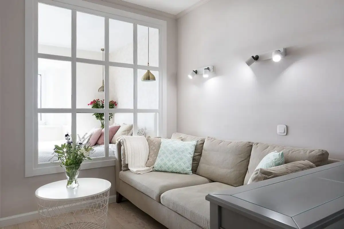
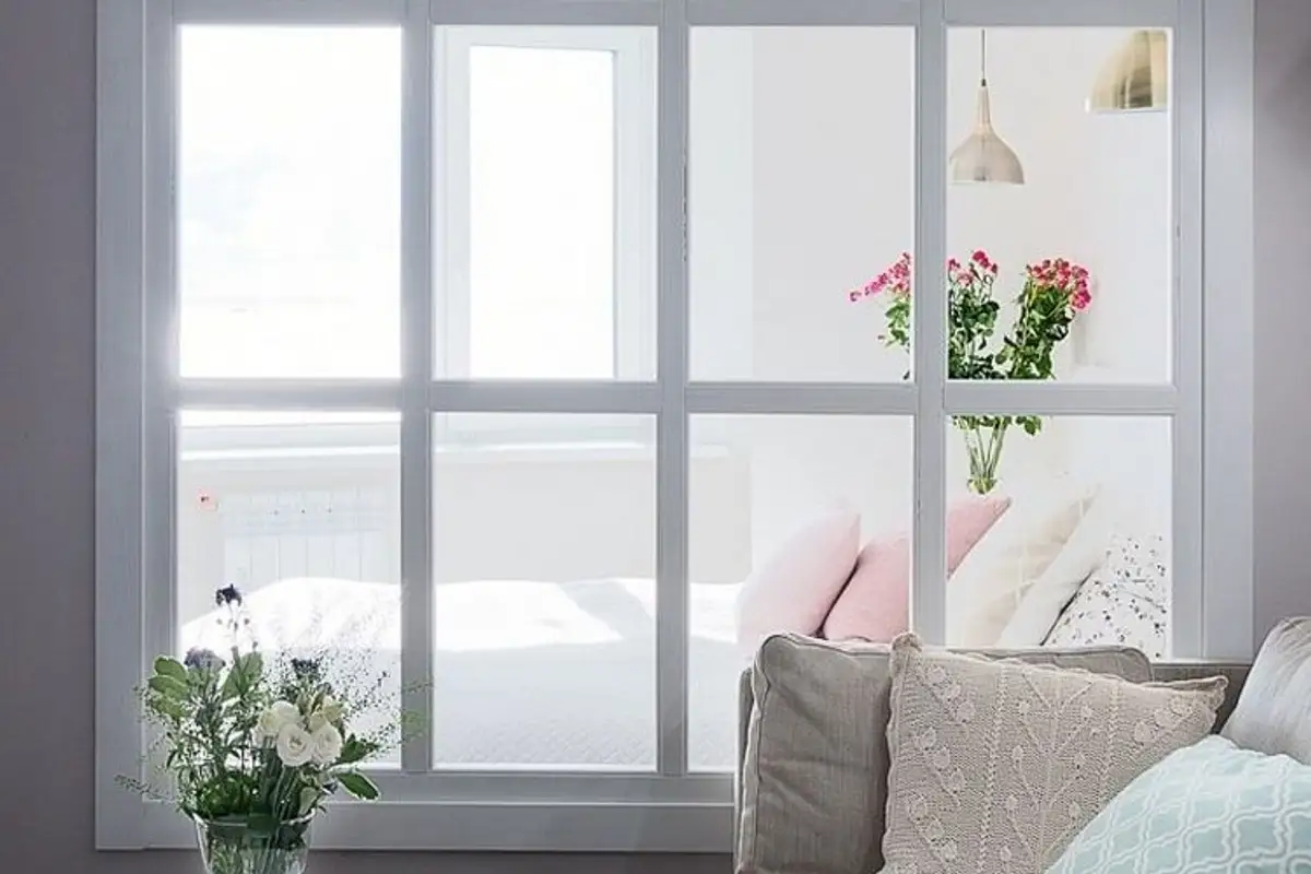
So that the living area wouldn't remain dark because of the second bedroom, Nika thought of integrating a generous interior window, almost as wide as the entire wall through which natural light could penetrate the rest of the room. Thus, after the rearrangement, the entire apartment seems brighter.
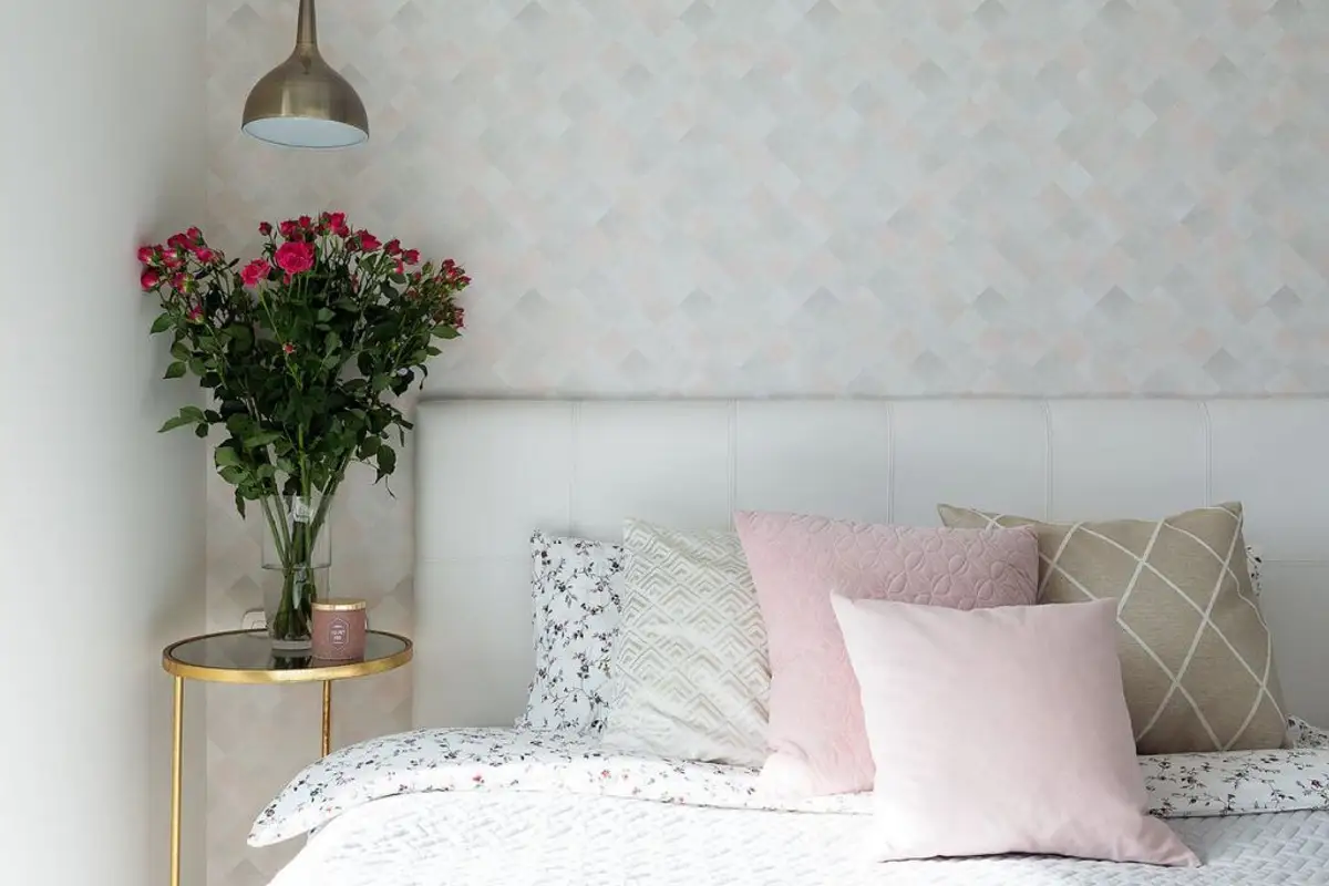
The finishes were chosen to outline a current, welcoming arrangement in pleasant colors with light tones and discreet prints. Many pastels were used, with blue being dominant; grays and beiges complete the neutral chromaticism of the arrangement.
You will notice that there are no suspended cabinets in the visible part of the living room in the kitchen area. The designer chose this option due to the lower ceiling height. Instead, to create the impression of vertical space, she chose to mount the tiles up to the ceiling.
The discreet pattern of the ceramic tiles distracts attention from the small ceiling height which would have been more noticeable in the case of upper furniture. It also helps with the lighting system consisting of spotlights and pendant lights that ensure uniform and punctual lighting for each function.