I fondly remember my teenage years when I was a convinced rocker and frequented all sorts of "colorful" places on a much quieter Lipscani than it is today. The only one of those places that still exists and perhaps the one that has remained most vividly in my mind is Fire Club. You can't roam the Old Town without having been to Fire at least once.
Above all, I am attached to this bar because it has been there since I discovered going out in the city, and what attracted me there at first still exists today: good music, beer, a relaxed atmosphere. So you can imagine how curious and eager I was when I found out that they were setting up a new wing for the bar.
How do you translate the atmosphere of a traditional rock bar into contemporary design? Constantin Goagea, Adrian Dobre, and Ștefan Ghenciulescu, the designers of the project, answer us.
This new wing of the bar is located in the passage between Covaci and Gabroveni streets, on the ground floor of an eclectic building built in 1925. The building is a mix of styles and functions: former student dormitory, former cheap hotel with all sorts of doubtful interventions and modifications added along the way.
But this did not discourage the architects; on the contrary, they found inspiration in this chaotic space where nothing is aligned or equal.
I forgot to mention that a hotel will be developed later in the courtyard of this passage, and this small bar has to serve as a breakfast room for the hotel. So the architects had to harmonize this concept with that of the rock pub and interpret everything in a contemporary key. They studied the history of rock pubs and thus arrived at the image of today's bar.
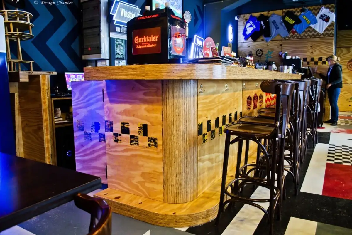
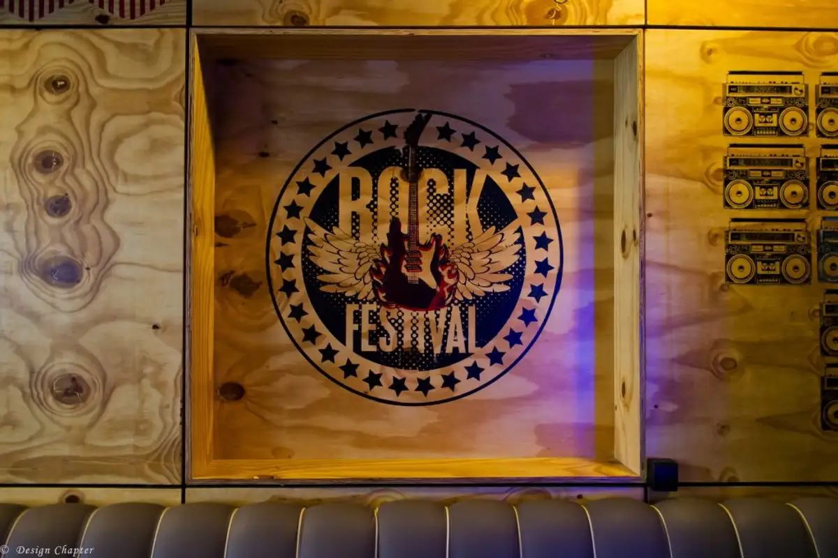
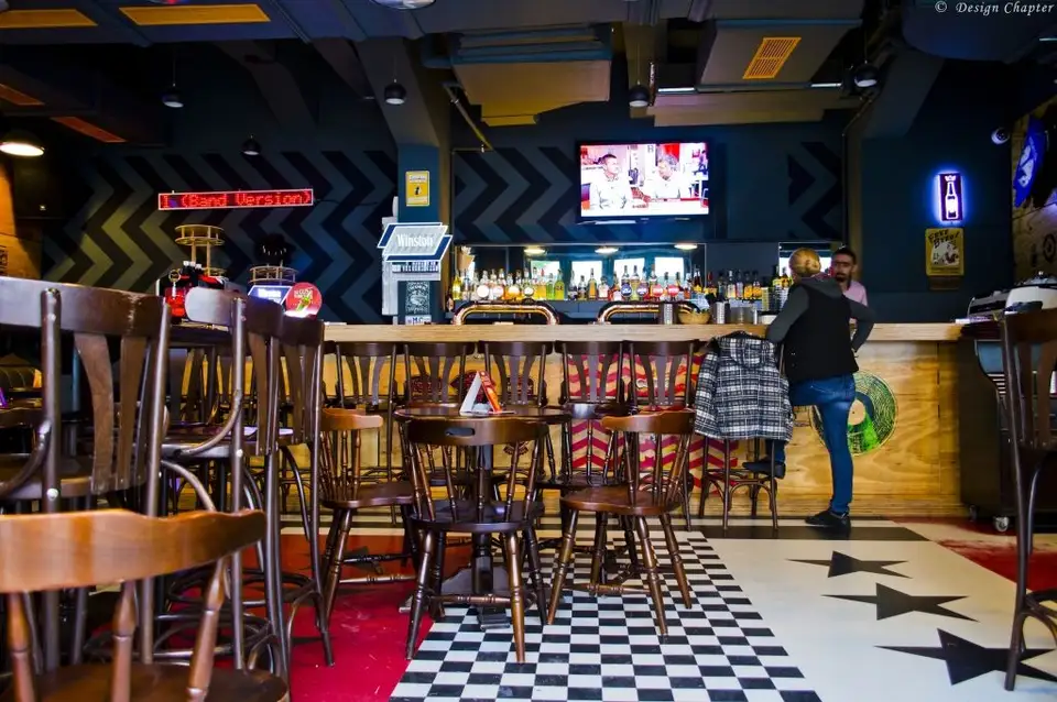
They chose a few key elements in rock culture: jukebox imagery – stars and stripes, industrial stencils made on wooden crates used to carry concert equipment. As for the floor, they managed to reproduce the desired geometry in polyurethane resin.
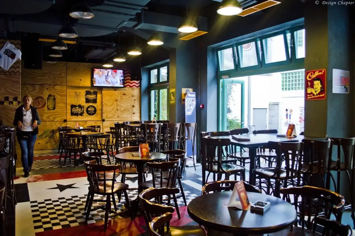
The ceiling is also very spectacular, with a network of beams stretching across it, between which the air duct system painted gray has been slipped and interrupted here and there by lighting fixtures reminiscent of motorcycle headlights.
I was particularly drawn to the industrial plywood panels on the walls with that very graphic grain of the wood, which is highlighted by the added graphic elements. You can also see the presence of geometric elements: zigzags, stripes, squares that are found both on the walls and on the floor.
In fact, an entire wall is painted in a zigzag pattern of light gray and dark gray, which has a very powerful visual impact.
As for the furniture, the architects decided that they had to return to the comfort zone of the customers, so they chose classic pub pieces, wenge wood furniture. They even say: "We realized that we are part of something comfortable and well-established in the routine of our clients, which we shouldn't change.