Prints are decorative motifs printed on various materials. In interior design, we encounter prints on furniture, decorations, and even certain elements that make up a room, such as walls or floors.
Thanks to these decorative motifs and color schemes, objects with prints offer dynamism to the room and bring it to life. An effect we desire to avoid the monotony of simple shades or when we want to make a change without too many costs.
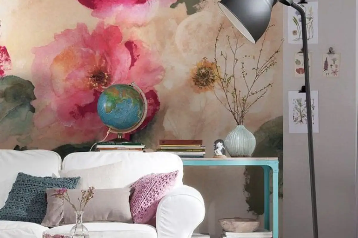
There is a wide variety of prints, ranging from simple geometric shapes to those inspired by nature, from simple two-color prints to multicolored ones. People usually avoid using prints in interior decorations for fear of achieving a tiring and overwhelming effect through their incorrect association or overuse.
You do need a little imagination and boldness to give your home the image you see in interior design magazines, but you don't have to be a specialist.
First of all, establish from the beginning what style you want to approach, but above all, consider the type of room. Thus, you will allow yourself more multicolored, bold prints in the living room and less in the bedroom, where floral, romantic ones with a simple chromatic are more suitable.
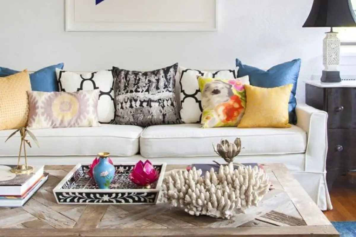
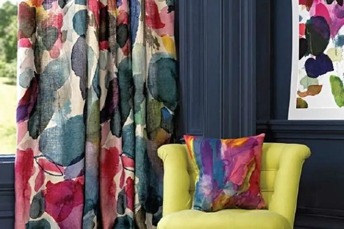
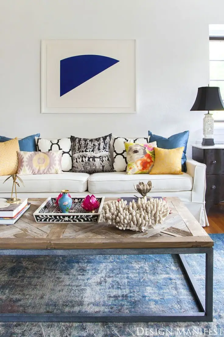
Here is an example of a living room that abounds in colors through the chosen prints. A bold but balanced choice. The interplay between neutral colors and strong ones is harmoniously maintained throughout the room. The center of interest is undoubtedly the sofa, whose strong colors are balanced by black-and-white combinations, accents from the curtains, and decorations on shelves and walls.
On the other pole, this bedroom imposes a simple print with a single color, blue, suitable for creating a feeling of peace and relaxation due to its destination. However, the purpose of using the print is maintained, that of alleviating monotony, in this case, neutral shades. Balance is achieved through the paintings on the wall.
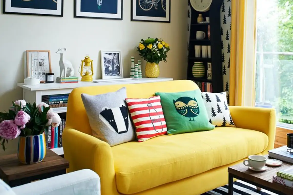
Another secret is to use prints only in one place, on an object you want to highlight and which will be the center of interest. Here you will find the main color that "directs" the rest of the room harmoniously.
This is the safest recipe, but you can use prints on multiple objects in the room, the important thing is not to overdo it and to keep the same shades so as not to create discordance.
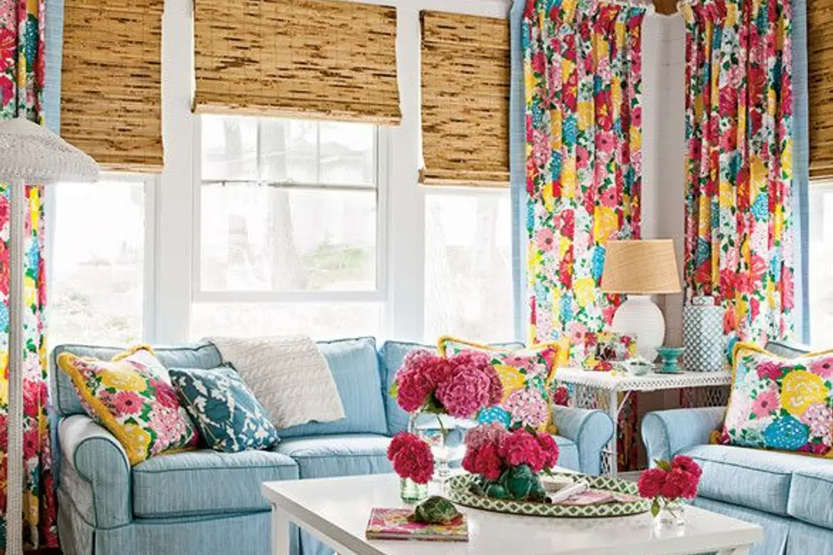
Here the emphasis falls on the chairs, which are surely the first objects we look at. The multicolored floral print is balanced with yellow accents from the table.