When it comes to colors, there are a few simple rules and some tone combinations that never go wrong. However, rules are often meant to be broken and the first thing you need to consider when choosing the right colors for your home is your own comfort.
Open GalleryWhat this means is that the color palette you choose for decorating rooms should contain those colors that you like the most and combine them correctly and successfully with other tones to achieve a beautiful, pleasant and friendly interior.
Don't forget that nuances are primarily responsible for the atmosphere of a room, so after you have already chosen the color palette for your home, distribute them across rooms keeping in mind the final image you want in each of them.
If you want to furnish or refurnish your kitchen, a space where you will spend a considerable amount of time anyway, being the place where you cook, where you have breakfast and sometimes even the place where you receive friends, think about a set of relaxing but tonic colors that help the space appear larger than it is.
To help you, here are some of the most commonly used colors and their effects if you use them in a kitchen.
Black
Black is never a good idea for large surfaces. It is associated with negative states and absorbs light, darkening any space. Black should only be used when you want to highlight certain accents.
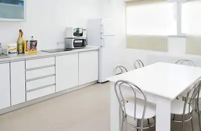
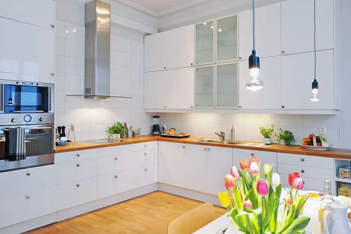
White
White reflects light very well and helps create the illusion of an open, spacious and airy space. We recommend it for kitchens, but only if you have a well-ventilated room and a hood that works impeccably because white gets dirty very easily, attracts smoke and stains very quickly.
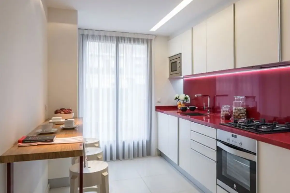
Red
Dark tones of red suggest warmth. Red is also an energetic and vibrant color. In general, it looks good in kitchens and creates a beautiful image associated with neutral colors and especially alongside white.
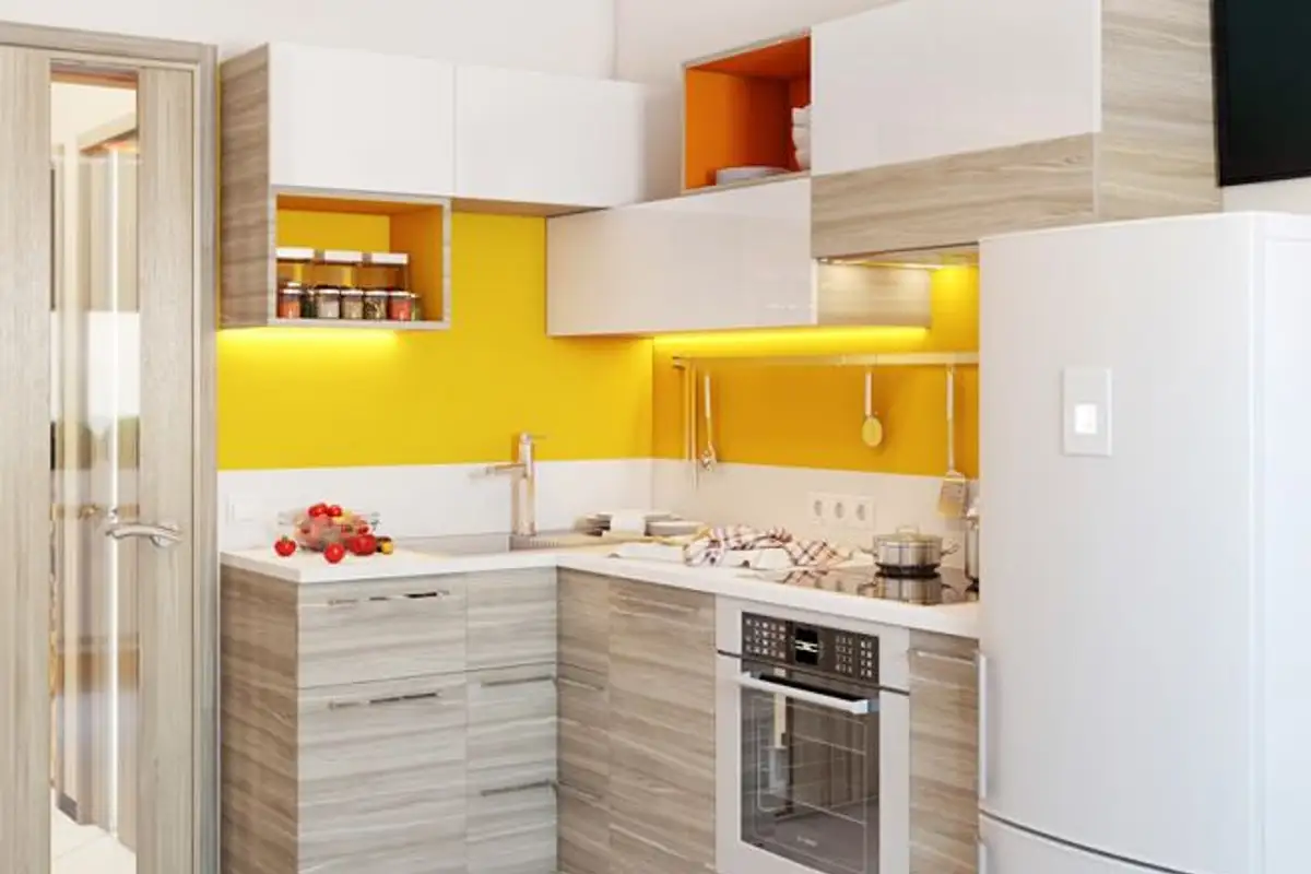
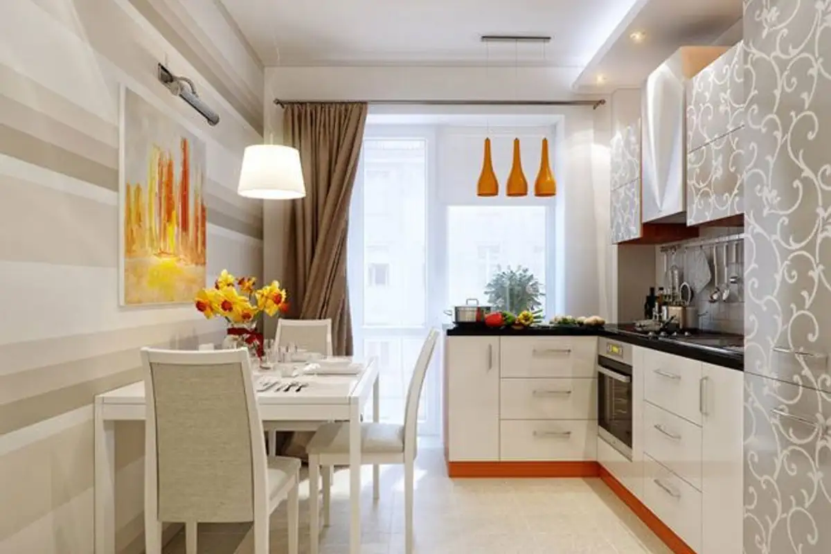
Orange