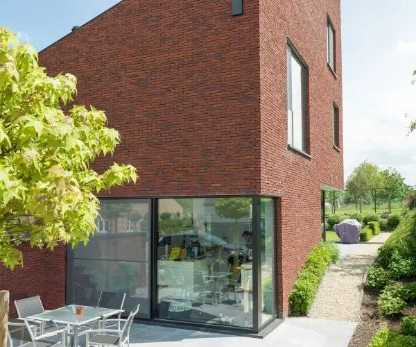
Design is often a matter of enchanting the visual sense. It is a fundamental principle that any architect or interior design specialist Interior design He recommends: establish a color palette and start from there.
Harmonizing interiors, punctuating details through contrast, and juxtaposing complementary textures will all flow much more smoothly and precisely once you've nailed down the primary stylistic feature of your future home.
Diversity thus becomes the key concept for any customer at the point of choice. Subtle nuances of the same material will tip the scales one way or another and leave their mark on the purchasing decision.
We appreciate clients who know what they want. We prefer a decisive, demanding client to one who is hesitant and always unsure of the outcome of their choice. To this end, at the beginning of spring, we are presenting an expansion of the range of shades and textures for BRIKSTONKLINKER.
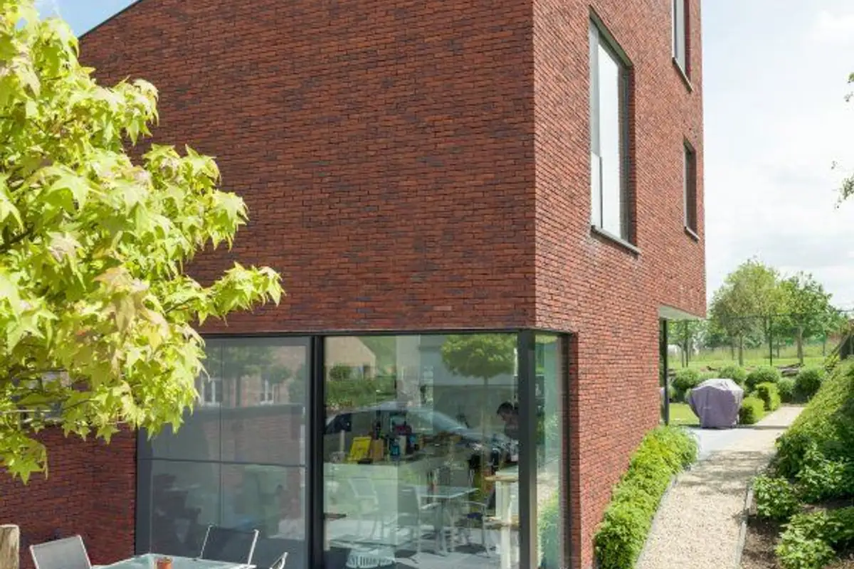
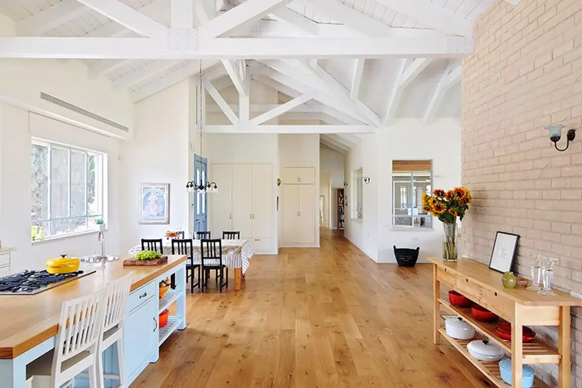
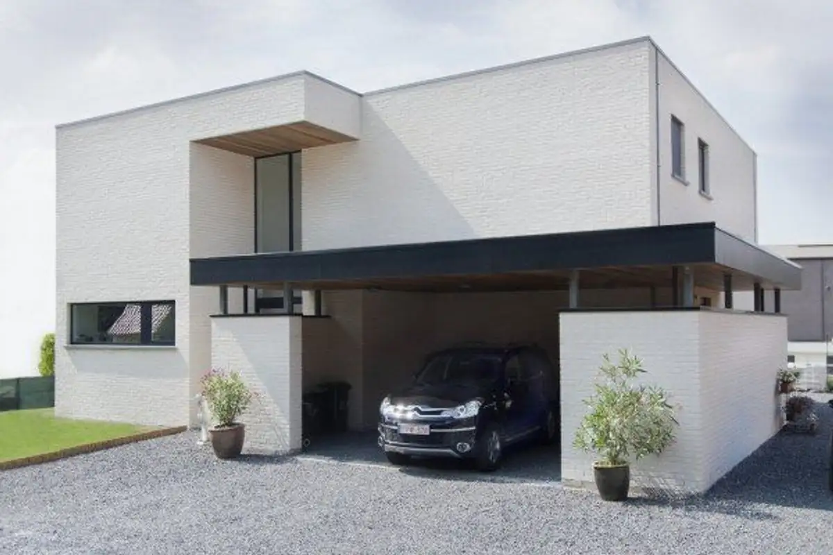
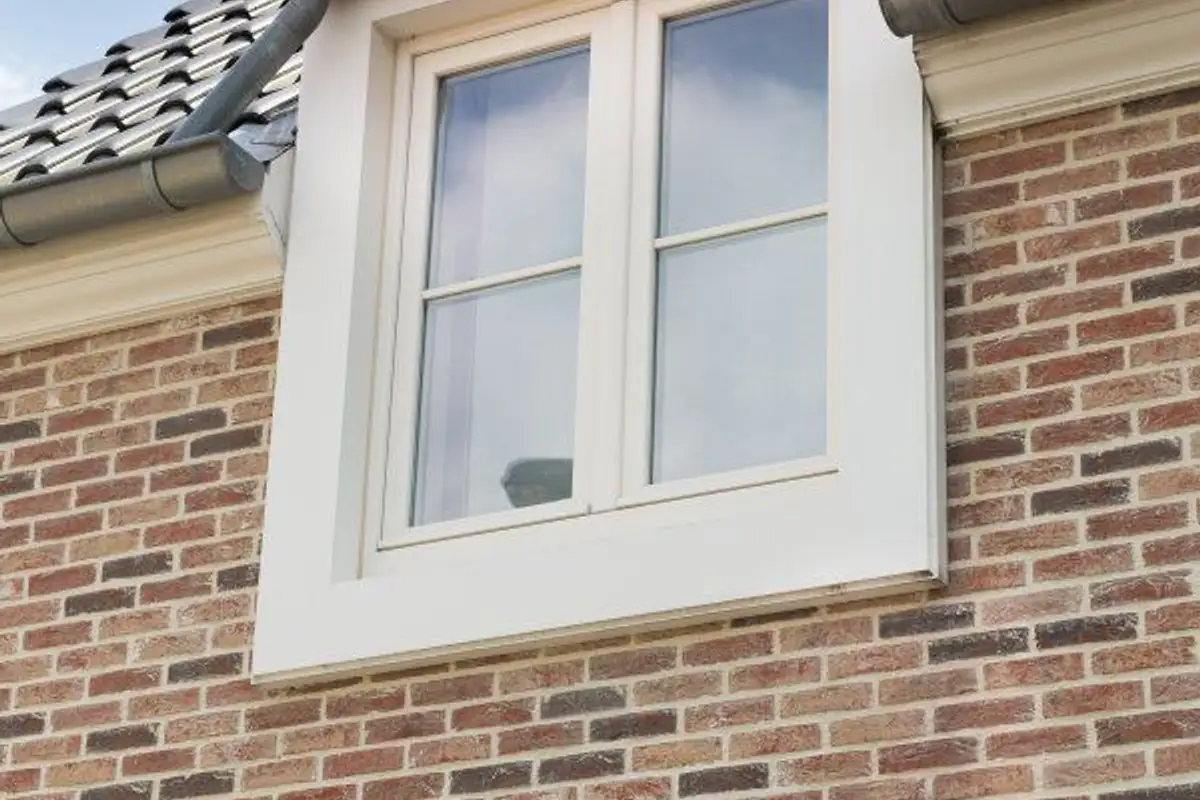
The inspiration for the new palette came from a desire to offer our clients as many varied and diverse answers as possible. You will find both delicate, powdery colors, ranging from pale pink tones to yellowish and cream hues, as well as vibrant, energetic colors.
You have every chance of finding the perfect combination for your interior or exterior designs within the new BRIKSTONKLINKER range of ceramic cladding and apparent brick.