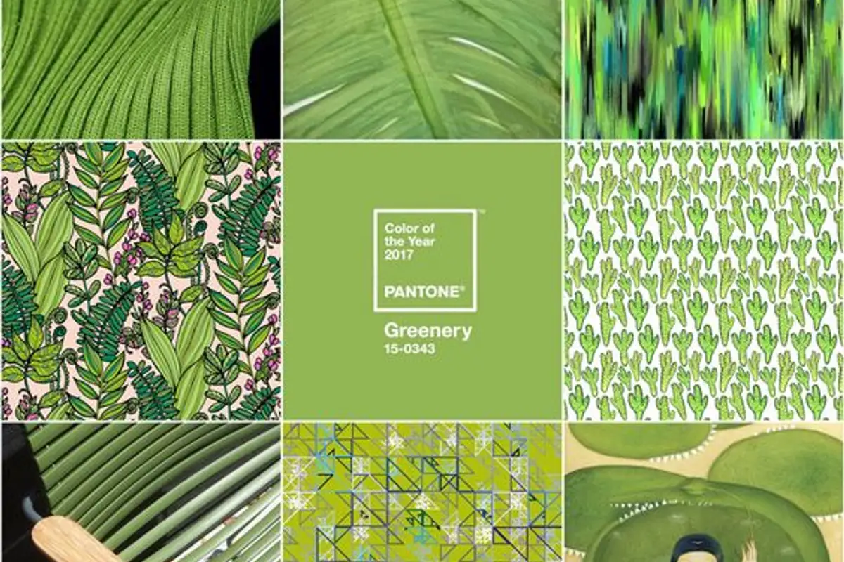
In a tumultuous socio-political context, the need for peace, for a return to nature and simplicity arises naturally. This is why, in this complex context, the Pantone Institute chose Greenery, a green hue, as the color of the year 2017.
After last year we enjoyed the Rose Quartz&Serenity duo, a balanced mix that spoke about wisdom, balance, reconciliation and harmony with ourselves, it seems that the trend continues, and the choice of this raw, springtime green translates to "a continuous need for revitalization, rejuvenation, and reconnection with nature and those around us," states Pantone.
Indeed, Greenery, this yellow-green hue emanates freshness, cheerfulness and reminds us of all those wonderful spring days, about new beginnings full of positive energy.
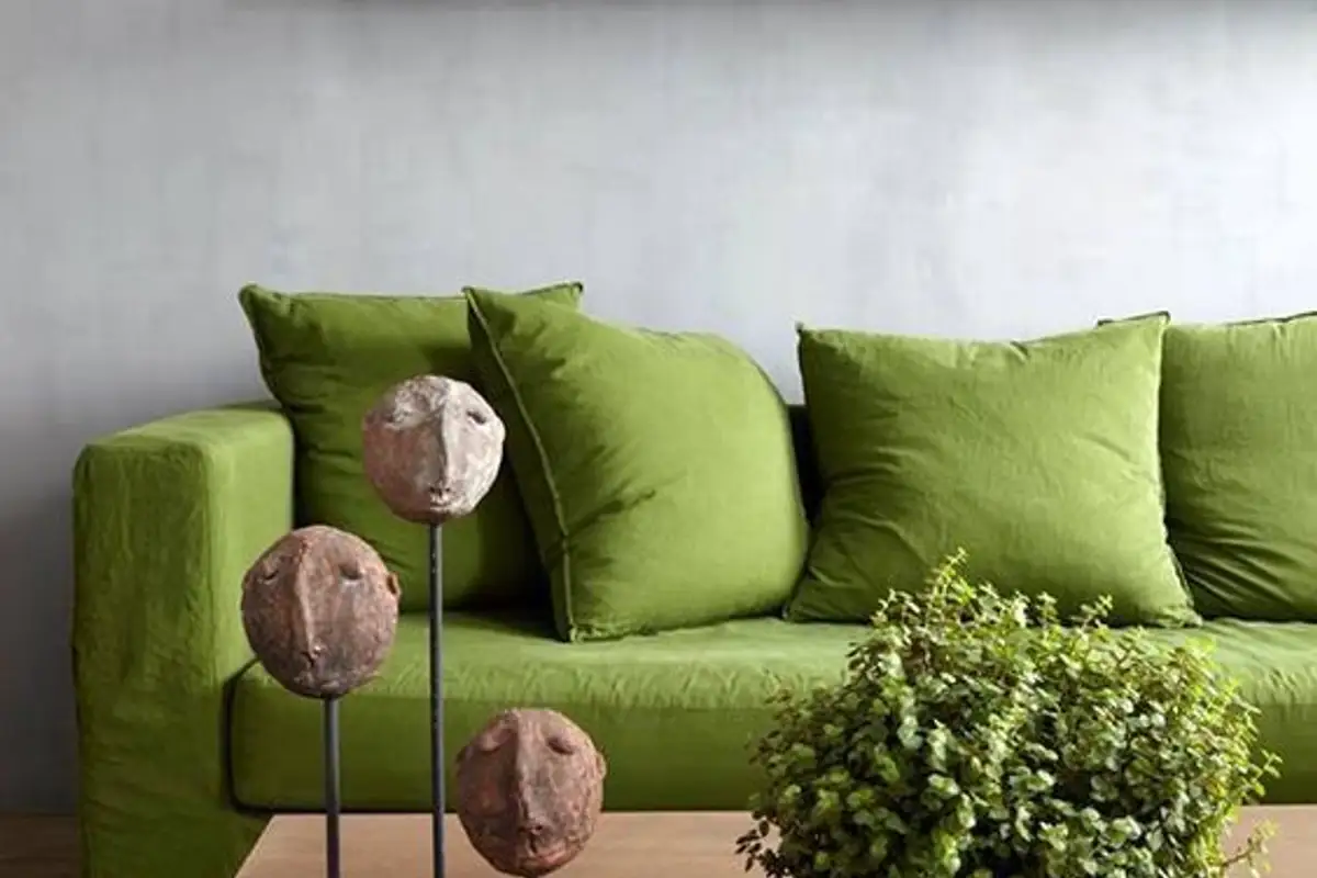
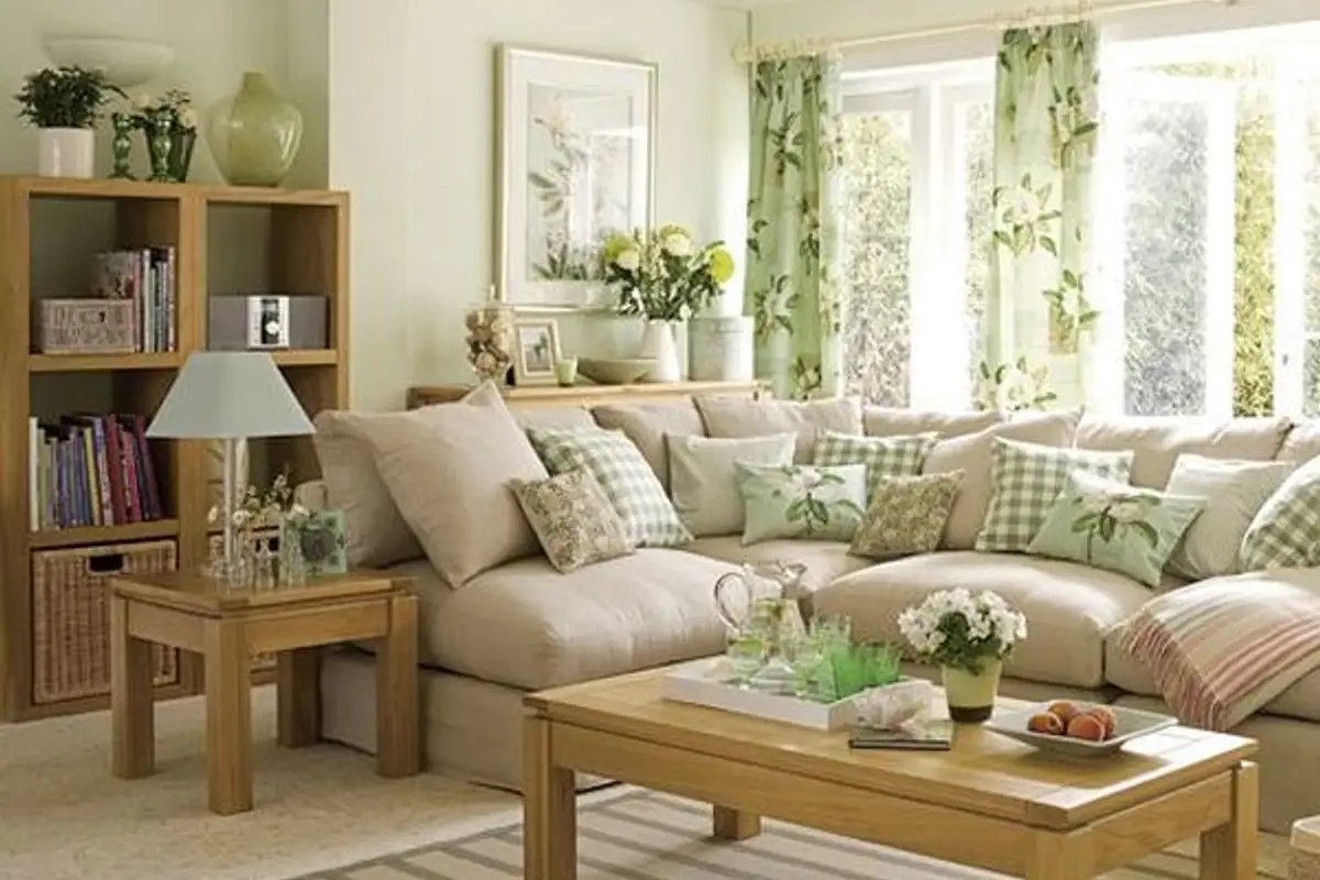
In terms of interior design, Greenery can be used in different proportions, the effect being one to match. Being such a versatile shade, we can find it in various spectacular combinations, such as pastels, grays, navy blue and even bolder, brighter shades.
How can we integrate it into our homes?
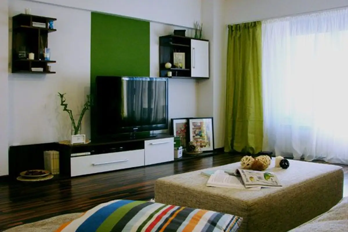
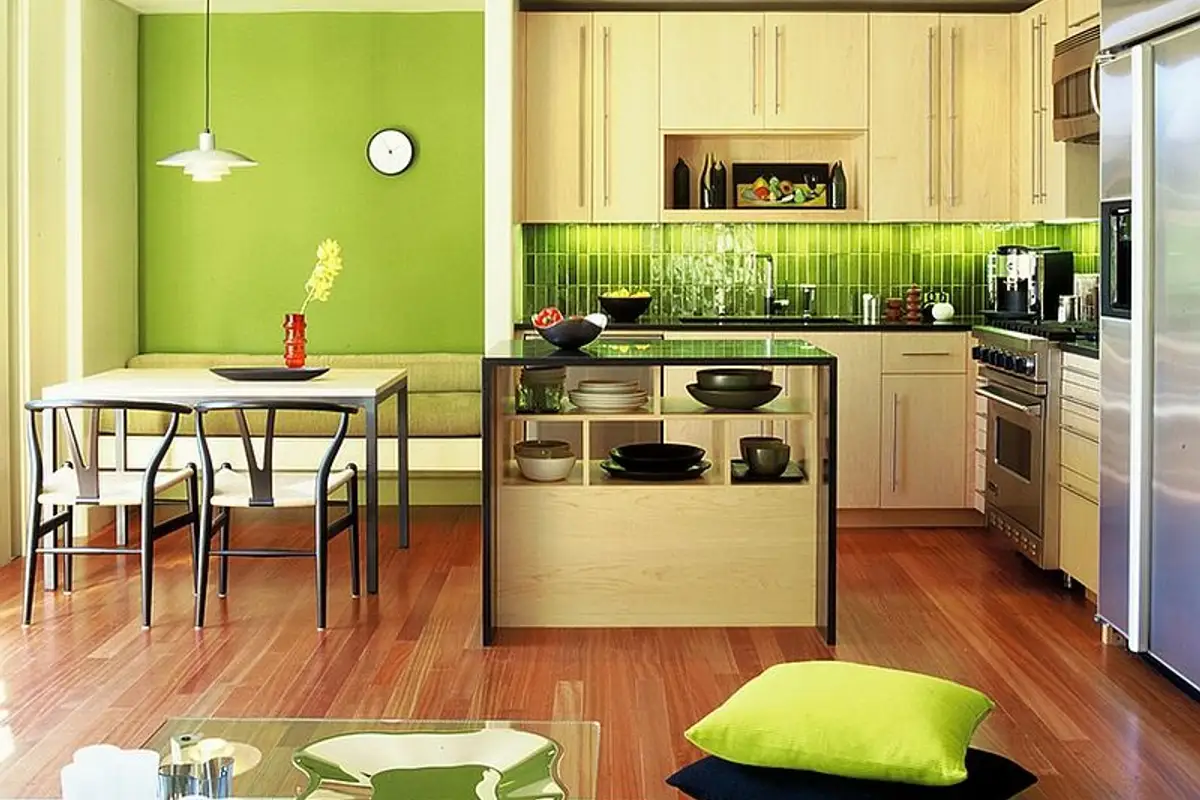
If green is already among your favorite colors, now you can explore more with this color without fear of making a mistake. Of course, while maintaining the proportions so as not to overwhelm the space! This green can be found in your interior design in the form of wallpaper with prints on a single wall, either in the living room, dining area or even in children's rooms.
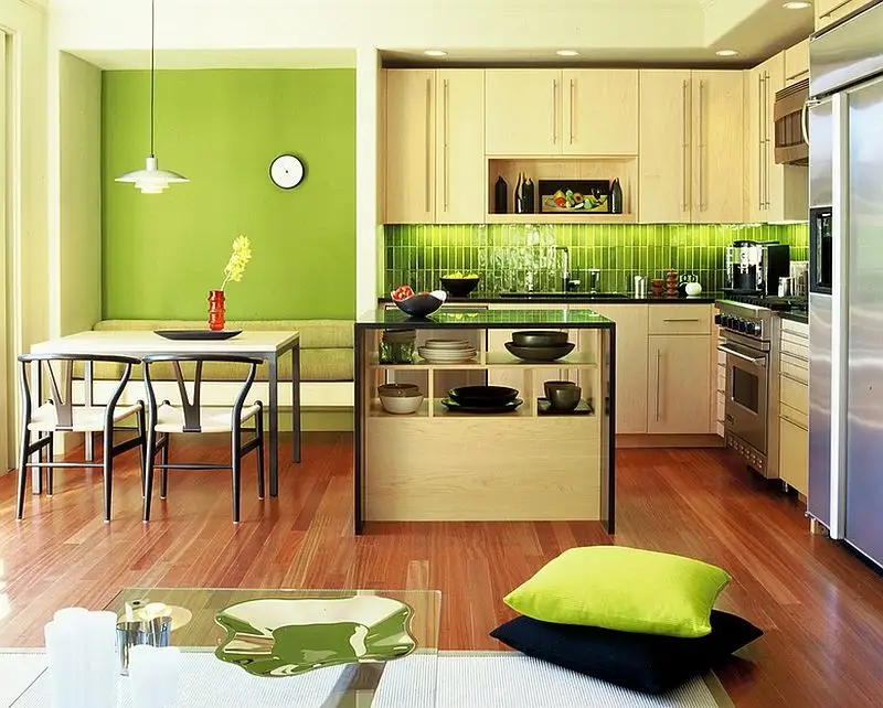
It could even be a headboard upholstered in a darker shade of green or the curtains in the room; the bedspread or the rug on the floor. Even the front between kitchen cabinets can be designed with Greenery green, either with decorative tiles or colored glass cupanou; in contrast to the white furniture you get a wow effect in the overall decor.