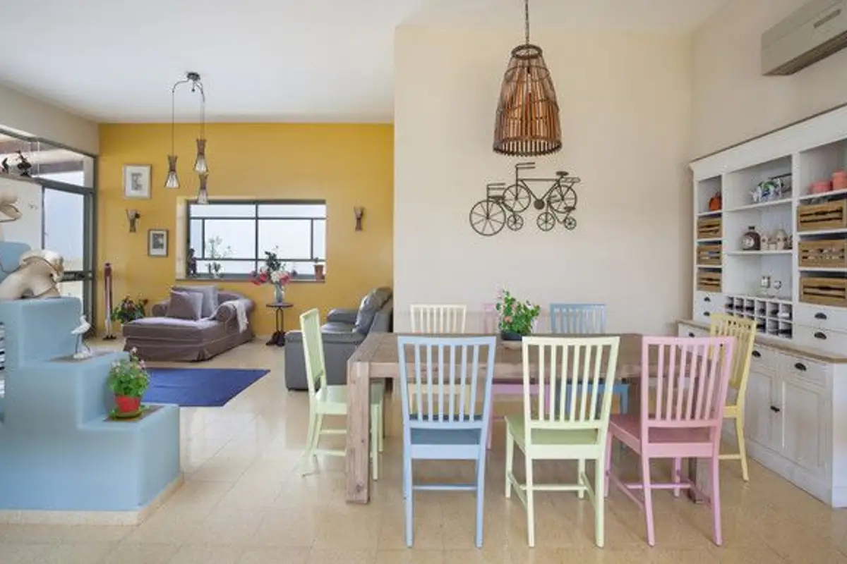
Ladies and gentlemen, here it is! The color of the year 2016 has just been announced by the Pantone Institute: Rose Quartz and Serenity.
Open GalleryFor the first time, Pantone proposes a duo of colors that, although contrasting, together create a pleasant balance. The warm pink hue and the soothing calm of the blue shade inspire us towards reconciliation, harmony, and peace. It is a statement against the turmoil of everyday life, a reaction to the events of a gloomy and agitated year.
The call for wisdom, moderation, rebalancing, and the discovery of the meaning of life is reflected in this symbolic choice of these shades.
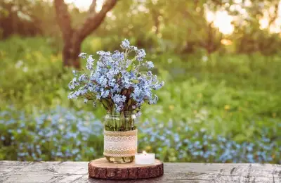
Rose Quartz is a soft yet convincing tone that conveys compassion and a sense of calm. Serenity inspires us with weightlessness, delicacy, transparency, just like the expanse of the blue sky, bringing feelings of respite and relaxation, even in troubled times.
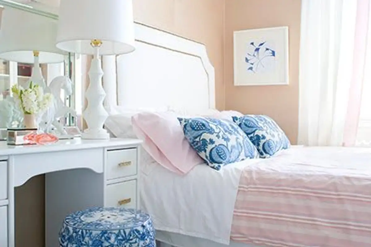
The combination between dusty pink and bluish-blue, these sweet pastels that remind us of the innocence of babies and their fragility, comes as a challenge to traditional perceptions regarding color associations. These pastel shades do not only mean sensitivity and femininity; their association speaks about the freedom to be yourself and express yourself as you please.
By choosing this combination of shades, Pantone sends a powerful message to each of us: change starts with you!
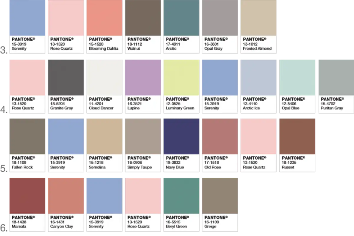
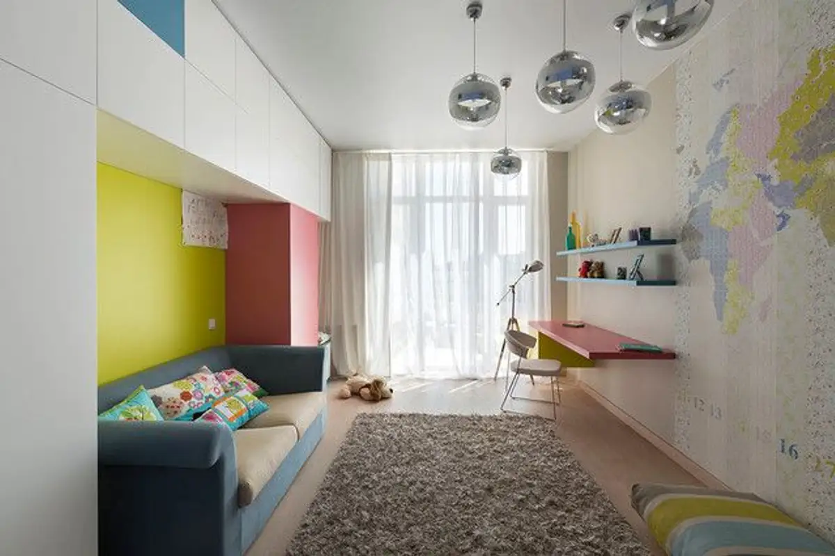
Decor inspirations are numerous; regardless of the desired finishes, matte, metallic, or glossy, this duo of shades combines pleasantly with tones of green and violet, brown-brown, and multiple shades of yellow or pink.

Rose Quartz and Serenity color association model