Special arrangements come to life when you work with special people. And architect Alexandru Bucur confirms this wholeheartedly through the arrangement he told us about with such pleasure: I met the owners through good friends and we became friends ourselves after this arrangement. We shared the same ideas from the beginning regarding the concept of the house's design.
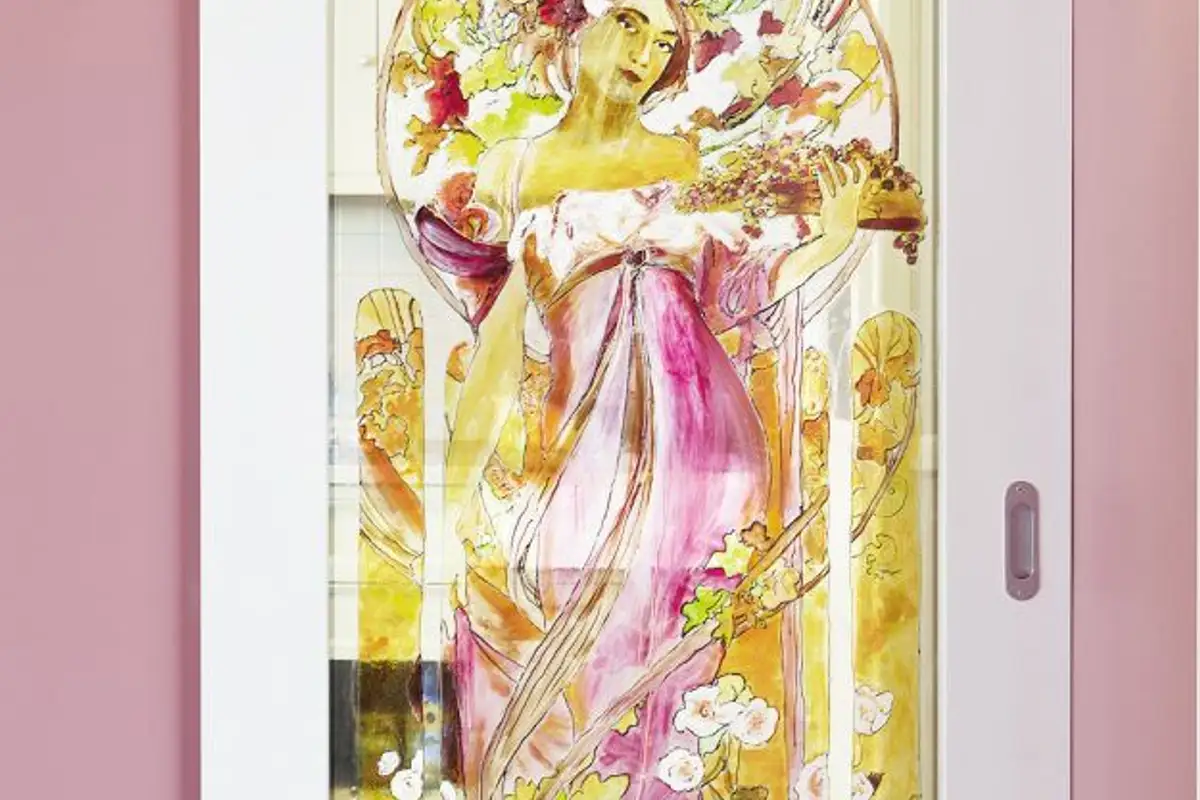
They are young, open-minded, modern, dynamic people who appreciate both classic beauty, that chic, those sophisticated things, painting (she knows how to paint, sew on a sewing machine), old objects (they acquired paintings and carpets from their travels), a typewriter from flea markets, which we managed to integrate very well into the concept.
Opening the GalleryKnowing and understanding the owners' needs for their home, Alexandru confesses that the first step was solving the basic problems of the construction. The house, belonging to an ANL project, was taken over "at red stage" and required major interventions, its condition being quite precarious. Every wall, every detail was reviewed.
In addition, the very fragmented compartmentalization of the ground floor proved to be a challenge in solving the design.
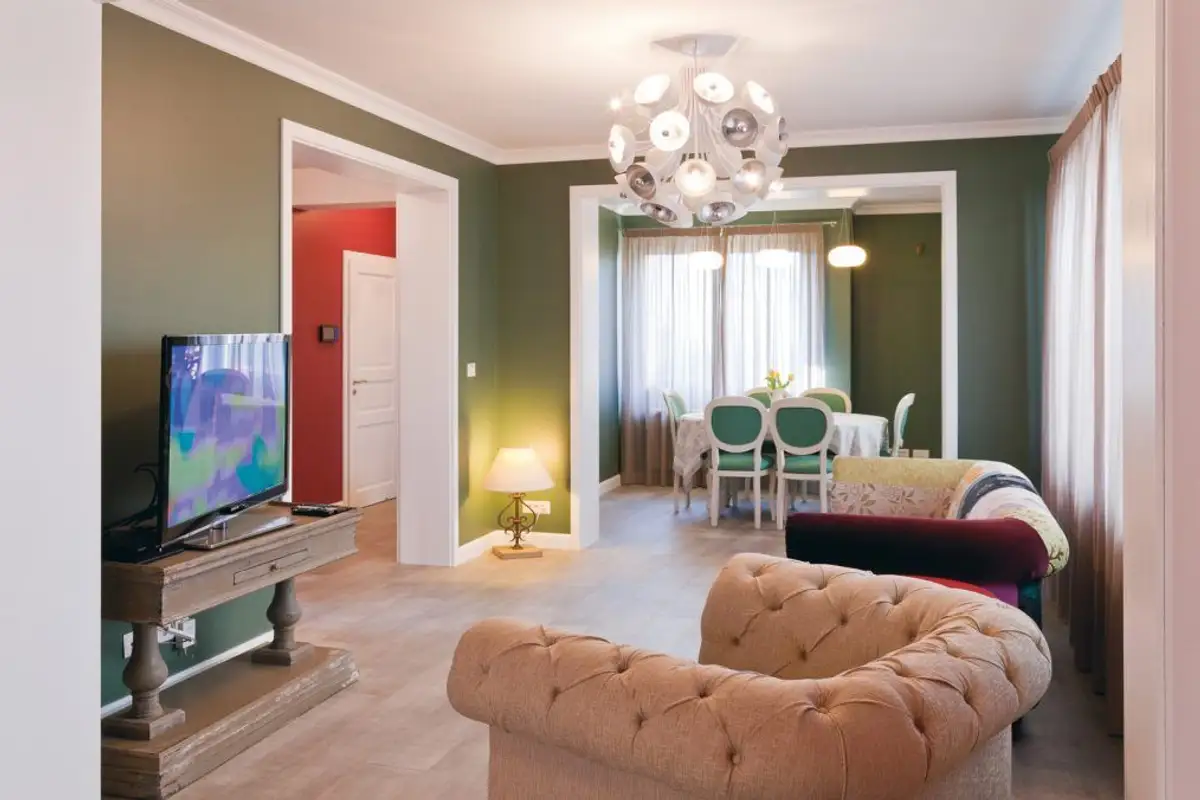
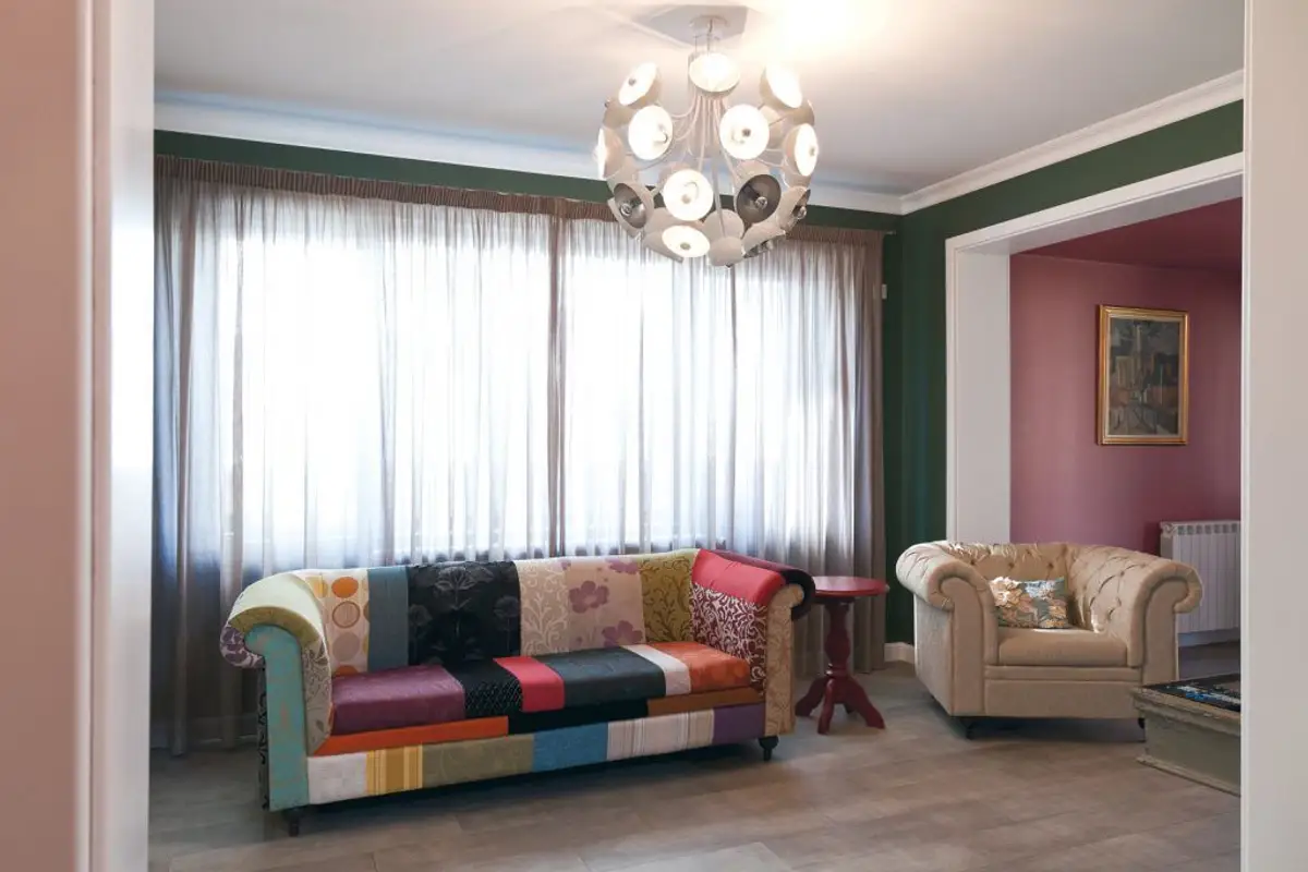
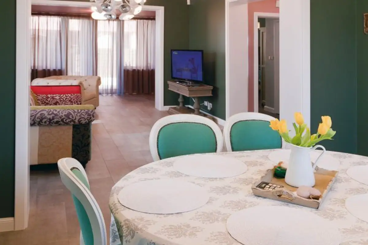
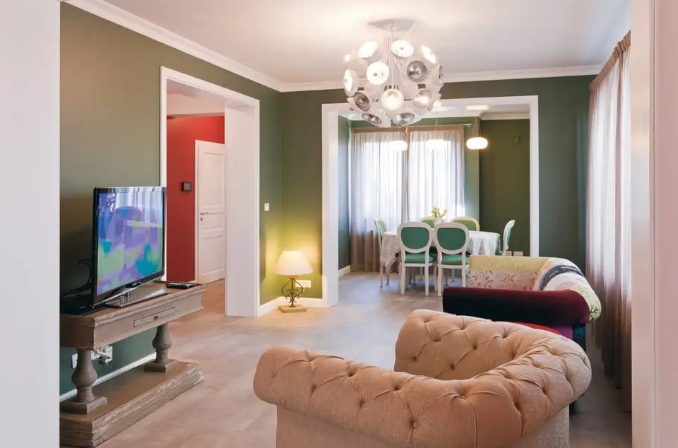
One of the solutions found was to delimit functions by color; the approach followed was the play of darker or lighter shades of the same colors. The living room and dining area are surprising with a deep, British green, while the rest of the rooms, although open, go on other contrasting nuances.
One of these is fuchsia red which can be found starting from the ground floor, continuing along the staircase to the attic. In the matrimonial bedroom we will find lilac colors in various tones, including on the ceiling, thus providing a sense of intimacy. The red motif is also found in the main bathroom.
Read also about this arrangement also made by the team of architects from Interiology
The colors have a strong character; they are vibrant shades in the ground floor and first floor areas, as the attic reaches a warm, sunny ambiance, in accordance with the natural light of the windows. That's why, for the flooring (Karelia Rock Salt parquet from Parchet pe Viata), we started from a neutral shade, a gray background on which this play of strong colors could be subsequently built.
To ensure unity at the level of the arrangement, the architect integrated contrasting touches of white, which we will find at the level of doors, frames, skirting boards, cornices, stairs, balustrade and even in the furniture. All are projected onto intense color backgrounds. At the same time, white counterbalances the rather low natural lighting due to the small windows.
In addition, very warm lights were used, thus highlighting the beauty of the colors used.