Principles of color psychology and how they can be applied in decorating different rooms.
Colors have a powerful impact on our mood, and their intelligent choice in interior design can transform a house into a truly harmonious and positive energy-filled home. Let's explore together how color psychology works and how you can use it to decorate your rooms.
What Do Colors Say? A Small Emotional Dictionary
Each color carries a certain vibration with it and can trigger specific emotional reactions:
Red: It is the color of passion, energy, and action. It can stimulate conversation and appetite, but used in excess it can become overwhelming or agitating.
Orange: A warm color, full of enthusiasm and creativity. It is friendly and invites socializing.
Yellow: Brings sunshine into the house! It is associated with happiness, optimism, and mental clarity. Too much intense yellow, however, can be tiring for the eyes.
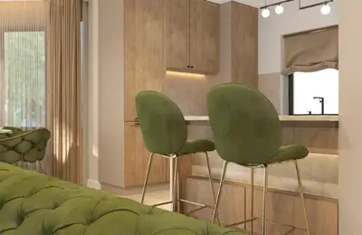
Green: The color of nature, balance, and tranquility. It has a calming and relaxing effect, being ideal for reducing stress.
Blue: Inspires calm, serenity, and confidence. It is perfect for relaxation and concentration, but too dark or cold shades can create a distant atmosphere.
Purple: A color associated with luxury, creativity, and spirituality. Lighter shades, such as lavender, are restful.
Pink: Emanates gentleness, affection, and comfort. It is a playful and calming color.
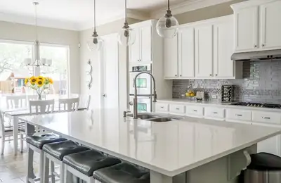
White: Symbolizes purity, cleanliness, and space. It visually enlarges rooms and reflects light.
Gray: A neutral, elegant, and modern color. It can be an excellent base, but it needs color accents to avoid becoming monotonous.
Brown: Brings a sense of comfort, stability, and connection with the earth.
Black: Powerful and sophisticated. Used in moderation, it can add drama and elegance, but in excess it can darken and shrink the space.